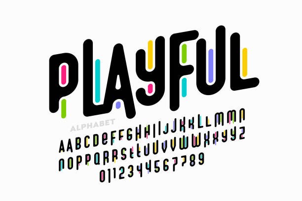
Your website’s voice isn’t just about what you say, it’s also about how you say it. Fonts, the silent communicators, play a crucial role in shaping user experience and reflecting your brand identity. But with a seemingly endless ocean of typefaces, choosing the right ones can feel overwhelming. Fear not, fellow web adventurer, for this guide will equip you to navigate the world of website typography with confidence!
The Power of the Perfect Font
Typography is more than just choosing a pretty font (although that can be fun too!). It’s about crafting a visual experience that complements your brand identity and enhances user experience. The right font can:
- Evoke Emotion: Imagine a playful script for a children’s website or a bold, serif font for a legal firm. Fonts set the tone for your brand’s voice.
- Boost Readability: Not all fonts are created equal. A clean, sans-serif font is ideal for large chunks of text, while a decorative display font might be perfect for headlines.
- Create Hierarchy: By using different font sizes and weights, you can guide users through your website, highlighting important information.
Font Fantastic Four: Choosing Your Champions
With a seemingly endless selection of fonts available, choosing the right ones can feel overwhelming. Here’s a battle plan to pick your typographic champions:
- Know Your Brand: What emotions do you want to evoke? Consider your brand personality and target audience.
- Start with Two: Limit yourself to two main fonts, one for headlines and another for body text. This creates a cohesive look without being visually overwhelming.
- Serif vs Sans-serif: Serif fonts (those with little decorative feet) exude a sense of tradition, while sans-serif fonts (clean and modern) feel more contemporary.
- Test, Test, Test: Don’t be afraid to experiment! Look at how your chosen fonts interact with your website design and test them on different screen sizes.
Beyond Basic: Advanced Typography Tips
Now that you’ve chosen your fonts, let’s explore some ninja-level typography tricks:
- Line Height & Letter Spacing: These seemingly small adjustments can significantly impact readability. A good rule of thumb is to set line height slightly larger than your font size and adjust letter spacing for optimal visual flow.
- Color & Contrast: Black text on a white background is safe, but don’t be afraid to experiment with color! Ensure high contrast for optimal readability, especially for users with visual impairments.
- Alignment & Whitespace: Text alignment (left, right, or justified) can influence the overall feel of your website. Whitespace, the space between elements, is equally important, allowing users to breathe and take in the information.
ConclusionFontastic Finish: Putting it All Together
Remember, website typography is an art, not a science. Don’t be afraid to break the rules (sometimes!), but prioritize clarity and user experience above all else. By following these tips and unleashing your creativity, you can craft website typography that’s not just functional, but truly fontastic!


